You are using an out of date browser. It may not display this or other websites correctly.
You should upgrade or use an alternative browser.
You should upgrade or use an alternative browser.
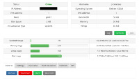
Looking for some feedback on our new control panel.
- Thread starter KuJoe
- Start date
Wintereise
New Member
Hire an UX engineer next.
telephone
New Member
That's pretty decent
Francisco
That's the direction I was going to go (clicking a button to reveal the password). Should be easy enough to do.My thoughts:
- Passwords should be revealed by explicit, voluntary action from the user only. A visible by default password field is not safe. On most applications, there is a "reveal password" button or checkbox next to the password field. I would stick to this widely accepted industry standard.
- The icon bitmaps are out of fashion. I am not a designer and my personal taste is probably bad, because your current design is good enough for me. But latest trend is clearly toward simple, flat icons without 3d effects or shadows, and essential typography (I would not use italic on the "your vps is on node..."). See the IOS7 or Windows 8 look as reference.
- The page should be usable on mobile devices. Try to open it on some typical smartphone/tablet screen resolutions.
I'll look into using different icons, I wanted something smaller to begin with so now is the time to do it.
I used the control panel from my phone and it's not bad, it's the same thing just smaller (maybe the larger icons are better for smaller screens and bigger fingers). I'll look into this some more.
No need to be sorry. This is why I opened the thread.Sorry, I don't want to be harsh, but it looks ugly for me. :huh:
Unfortunately that's not in the cards. I'll look into some pre-made control panel themes though and see what I can do.Hire an UX engineer next.
It loos identical to SolusVM, I was hoping to get away from the SolusVM feel but it does give me some good ideas.
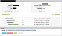
Here's what I've come up with: https://securedragon.net/imgs/index.php?sfpg=d3l2ZXJuLyoqMWIxMGUxZTI5ZjVkZTJlMjg0ZGU3ZjAxYzcwZDQ5ZDM
I like it, as long as it's functional, but for some reason it makes me think it's still 2006, even though there's a hint of bootstrap. But functionality over design any day, if it works and works well who gives a toss if it looks good.
Also, just a simple Google search can get you a lot of design ideas, I personally hate the design side of things, mainly because I'm rubbish at it but looking at some Themeforest junk and some of those CSS example code websites does help.
Also, just a simple Google search can get you a lot of design ideas, I personally hate the design side of things, mainly because I'm rubbish at it but looking at some Themeforest junk and some of those CSS example code websites does help.
I like it. Now does the Generate SSH console create a console via browser right there? Is it Java Based?
Looks good keep the design simply add the historical data choices for hour, day, month and year. Is the console resizable?
Awesome. I do see it is bootstrap, but maybe adding @FontFace CSS3 fonts or some CSS3 styles, it would be awesome! I'll test it out if you need some help.@NodePacket No, I hate the Java-based consoles so I went with the SSH console instead.
The graphs will only be for 24 hours, I might add more later but if a client needs more than 24 hours of data they can easily keep their own graphs.Looks good keep the design simply add the historical data choices for hour, day, month and year. Is the console resizable?
The console is an SSH session that can be connected to with any SSH program. The console is designed to be used for emergencies only and the session expires the next day (not 24 hours, next actual day so if the session is generated on the 26th it will expire on the 27th regardless when it was generated). For now I'm just using SolusVM's SSH wrapper for the console but I hope to have my own developed eventually.
I have no clue what that is so I'll have to look into it.Awesome. I do see it is bootstrap, but maybe adding @FontFace CSS3 fonts or some CSS3 styles, it would be awesome! I'll test it out if you need some help.
k0nsl
Bad Goy
That looks a lot better 
Here's what I've come up with: https://securedragon.net/imgs/index.php?sfpg=d3l2ZXJuLyoqMWIxMGUxZTI5ZjVkZTJlMjg0ZGU3ZjAxYzcwZDQ5ZDM
Mr. Obvious
Member
SrsX
Banned
That looks nice, if you ever want to sell that design there let me know as I'll purchase it off of you.


