amuck-landowner

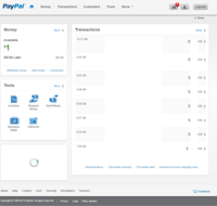
PayPal New Homepage

SkylarM

Well-Known Member
Verified Provider
They just need to update the personal dashboard to be similar to the business one. Personal one still looks awful.
 

notFound

Don't take me seriously!
Verified Provider
Forget the home-page, maybe if they made queries faster on the actual dashboard it might be an improvement.

They just need to update the personal dashboard to be similar to the business one. Personal one still looks awful.
Wait business has a different dashboard? I guess this is a US only thing. :(
 

SkylarM

Well-Known Member
Verified Provider
Excuse the doctoring and such, but this has been a "beta" for business accounts for a few months now. Not 100% sure on it's availability. It's faster than the "classic" design for sure.

n41yZCq.png
 
Last edited by a moderator:

Cloudrck

Member
Verified Provider
Excuse the doctoring and such, but this has been a "beta" for business accounts for a few months now. Not 100% sure on it's availability. It's faster than the "classic" design for sure.

n41yZCq.png
Never knew of this, how did you go about changing your theme?
 

FLDataTeK

New Member
Verified Provider
Seems like all the companies are going to that responsive type look. Namecheap did the same thing.

I like the clean look but it doesn't look professional to me.
 

Cloudrck

Member
Verified Provider
It was a paypal email with an opt-in link. I don't have that email anymore.
I probably got it too, but never paid attention to it.

Seems like all the companies are going to that responsive type look. Namecheap did the same thing.

I like the clean look but it doesn't look professional to me.
Everyone has their own opinion on what "professional" looks like. To me it's very professional. None of if it really matters though, if it's functional and intuitive.
 
Last edited by a moderator:

mojeda

New Member
Seems like all the companies are going to that responsive type look. Namecheap did the same thing.

I like the clean look but it doesn't look professional to me.
I honestly don't like namecheap's new look.

There is like 3 menus now, the top menu, the middle menu and the hidden side menu. At first I couldn't figure out where to go to my domain dashboard...

Also they changed only the stuff around the dashboard so the dashboard is still the old ugly style.
 

JavaPipe.Josh

New Member
It is much better than the one they had prior. I bet they are feeling the heat from competitors like Square. 

Has everyone adopted the new "logged in" them yet? I have not. 
 
Top
amuck-landowner