You are using an out of date browser. It may not display this or other websites correctly.
You should upgrade or use an alternative browser.
You should upgrade or use an alternative browser.
VPSBoard New Logo
- Thread starter Nett
- Start date
@ MannDude
I had to put a black backgound to see the image properly on the forum.
I emailed you the files with the transparent background which is really the only way to test to see how it looks on the forum.
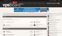
This is what I was referring to:
Doesn't really fit where it needs to. Here is the .PNG (ignore the aliasing) I got sent back applied to the theme via the element inspector...I really like @tonyg 's revision!

It makes that area too big. I could make the logo smaller... but I think the text would be too small if I shrink the entire logo so that it wasn't too tall.
I appreciate the effort, but even if the edges were smooth/not-choppy I don't think I want to use it.

