Hm interesting.
I can't stop but see Ponemon as Pokemon.
Jokes aside, the research paper they've published focuses on simply addressing the goal/idea they want to express and I think they missed some valuable opportunities to perform a proper analysis. I'm sure it works and makes sense for their use, but this research seems really incomplete. Now there's no abstract so I'll simply rewrite the important parts of their research.
Disclaimer: I am a climate change adaptation and climate change impact assessment researcher. I am published and have presented at various conferences, universities, and events. This however does not mean that I am an expert in data center operation. While the analytical skills are similar they are in different fields and therefore I am not fully aware of all the impacts and information required when performing an analysis on data center operations. Therefore, please be critical thinkers and don't take my own interpretation and comments of this study as the final "end-all be-all". Honestly I'm sure if I actually talked with the authors of this paper they'll be able to answer all of my comments and questions to a satisfactory level. Therefore, the information below is written simply for entertainment purposes and just questions I had when I was reading this paper. For everyone else, if I am incorrect then please feel free to let me know.
=== Quick Review ===
Research Background
Study was over a 6 month period and was funded by Emerson Network Power. This means limited data collection methods without disrupting normal operations.
Data Collection
The firm collected data by sending out surveys to each data center and then a phone call to the datacenter. They contacted 63 data centers (had their contact information from a previous study they did) and 31 organizations responded (with a total of 41 data centers).
Methodology
Basic statistical analysis of the raw datasets and graphics generation.
Results
Charts given above.
Analysis of Finding
3 major points and 5 secondary points.
- Basically removing unused hardware (which will still eat up power and cooling and such) will increase operating efficiency and energy efficiency. (Basically taking power saving measures)
- Economies of scale is a major factor. (This is a no brainer. If you run a bigger operation the bottom line will be more expensive but the per unit basis cost will be cheaper. This is the law of economics).
- Variance in rack density wasn't significant enough and is considered negligible since they're focusing on data center size and range.
Conclusion
As you know, there is no actual conclusion in this paper. In a proper research paper "Analysis of Finding" should be written as "Results" and the graphs are generated to support the findings in "Conclusion". The conclusion is where the decision related with the research is supposed to be located. They seem to try and use "Analysis of Finding" as a pseudo results-conclusion section of the research paper but I think a proper conclusion section would really help out with driving the key points of this paper.
=== Quick Review ===
My Analysis
Overview
The research they published doesn't introduce anything new. It reinforces the concept of economies of scale. The funny thing is though, a business's decision making process should have already performed a similar study (regarding their own situation/deployment), so maybe performing an analysis on their "forecasted dataset" vs "observed dataset" would be an interesting analysis. However, this paper right here reinforces what everyone knows: buy big, it's cheaper per unit.
Table 2
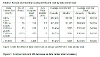
For column 1, I think a linearly increasing scale would be important and more valuable for analysis. Mostly since the first entry is from 500 to 5000, that's a very large variation in spacial area (that's a factor of 10 right there...). Then the second row is a factor of 2, then it's a factor of 2.5, then a factor of 2 again, then "rest". It doesn't seem like they broke the dataset down to make it evenly distributed either so besides for making it "look" aesthetically pleasing for the reader, I don't see why the data should be broken down in this manner.
Column 2 should be "Average Number of Racks", not "No. of Racks".
What interests me about this table is that the average rack density value increases as the data center size increases but then drops off when it gets bigger. Does this mean that for a larger datacenter size people usually space their hardware out better? Why do smaller data centers have a lower average rack density? Most would expect them to be around similar values wouldn't they?
Figure 1
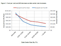
I'm the type of guy who hate graphs like this. It's a line graph but the two data points they're showing on there have no real relation with each other. Usually when you put a graph like this on you want to show that the area where they intersect has an important meaning behind it, however because the unit axises are incorrect representing data in this format should be incorrect as it just doesn't make reasonable sense to put them on one graph. Even if they were on the same unit scale ($) it wouldn't make sense since the important information they're trying to show is that as the square footage increases the annual cost per rack and per unit of power decreases. Just have two graphs for that.
Figure 2
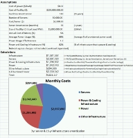
Now this shows the breakdown/distribution of what percentage of the total costs are for. What interests me is why is the "amortized plant" value increase from 5% to 6% then back to 5% for rest of the area? Is it because one organization they surveyed had a different policy? I don't know just interesting. This point really doesn't matter though.
IT Assets and Operation. Shouldn't this value be decreasing thanks to the rules of economies of scale? Increased square footage would increase the number of IT assets (which if you looked across the average range is fairly even with slight variations) and the operating costs all remain the same (I'd expect them to be decreased). Anyways this is just my comment expressing how these data points not showing the expected results I was expecting and instead remained constant as interesting and something I think should be investigated further. However this chart (I think) expresses some major concerns.
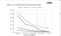
So this is the total costs by category. This means that the most sensitive variable (or most impactful variable) is the cost of energy. As your DC grows from 500 to over 50,000 sq ft, energy costs becomes the larger factor to impact your bottom line.
Figure 3
However due to the large number of racks, if you look at the "per rack basis" (aka rack density) then again, all the values will start decreasing. However the Y axis is missing it's label and someone really needs to write "by rack density" in it.
Figure 4
I think Figure 4 is a useless variable to graph the relationship of. It seems this is a bigger difference on deployment over anything. 2.5 kW/rack and all the categorized fields are basically direct rips from the table above. I think this is meaningless. Now if there were more data points available and a chart with more data points than five were available, then I think this would be more useful.
Figure 5
Now Figure 5 is what interests me the most. They recognize there is a big difference between colocation costs and operations vs the other industries which own datacenters or have a presence in a datacenter. These values do not surprise me.
Final Thoughts
The paper confirms what I was thinking before, and therefore strengthens economic arguments. There's nothing more really to talk about though. I think future studies should include a breakdown between each industry that uses a datacenter and maybe an analysis on the forecast/projections vs observed. I mean as a business you usually do the research and say "is this reasonable? Does this make sense?", do the studies, and then say "yes this is reasonable" and then you execute the plan. So why not look into that?
You know what would also be interesting? Maybe think of this problem in an economic level. Using the cost of living index normalize all the values for each city/location you're living in, then perform a comparative analysis depending on each region (e.g. Midwest, East Coast, etc.). From there, then form the analysis for the overall area. Remember the cost of power in San Francisco does not cost the same for BHS. While the cost of living index will not factor in for all of the impacts related to it, most analytical equations for most fields/industries do start with an energy balance concept, therefore I think it will be a good start to increasing the accuracy of your research. Then I think it might be a more reasonable research. I think there could be a wide variety of unknown variables which are impacting this study's results that you need to account for. I mean 5 dollars of buying power in Florida isn't the same as 5 dollars buying power in New York now is it?
It's an interesting paper and it can be really exciting and fun. I think it needs more time (and funding) to get it there.
 :
:


 :
:
